bit.ly/surfNSW
Click the graphic you are interested in to go to that MHL page. Note the explanation at the bottom of this page.From North to South
Byron Bay
Coffs Harbour

Crowdy Head

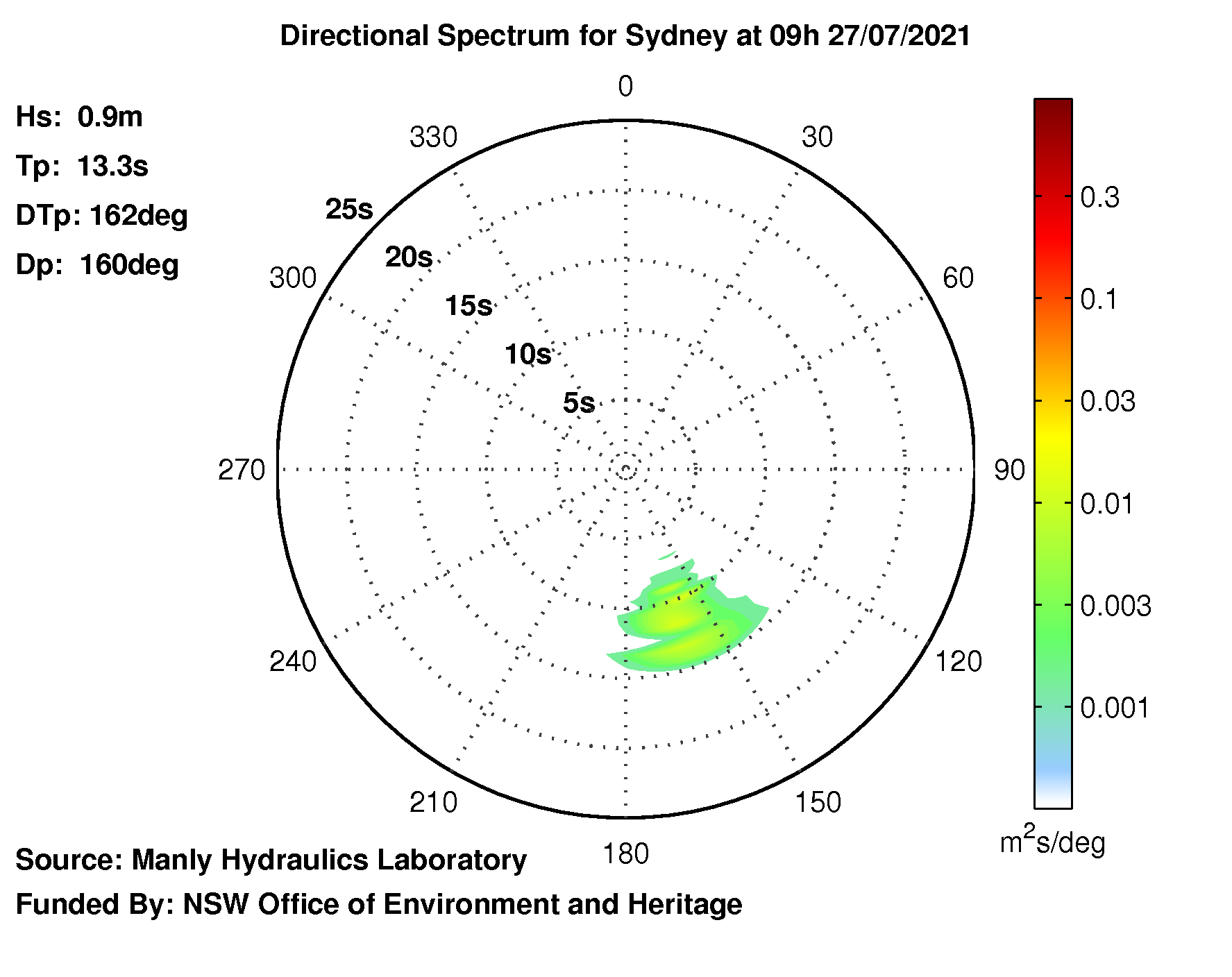
Sydney

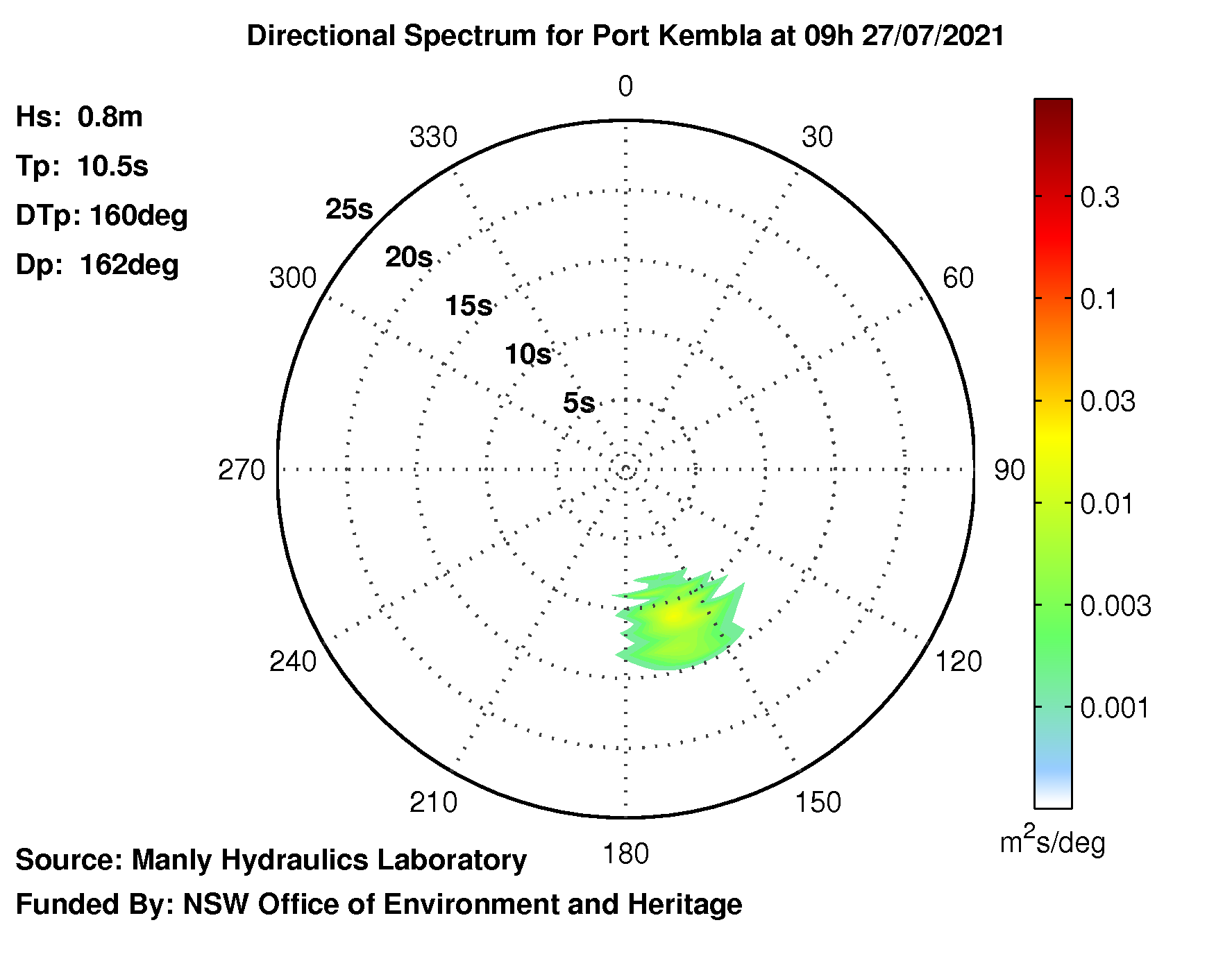
Port Kembla

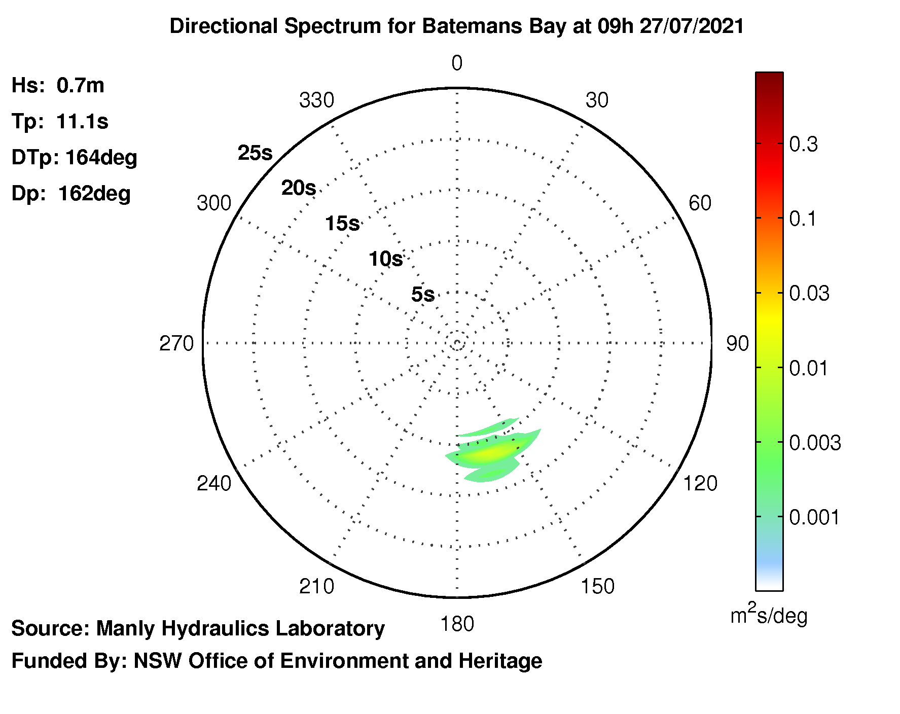
Batemans Bay

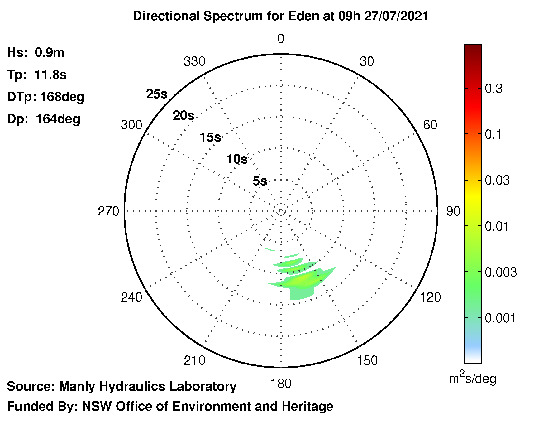
Eden

Reading the graphic:
Good swells (long period swells) have strong colour away from the centre, chop is energy towards the centre (short period). The colour shows the amount of energy at that combination of direction and period.
A short stripy curve of the same period energy is preferable to a big blotch over a range of periods and directions.
These images are direct from Manly Hydraulics Laboratory and together they provide an overview of the swell on the whole NSW coast.
To see examples of Directional Spectra see: ssurfings.blogspot.com.au/...directional-spectra-translated If you see weird or blank graphs it usually means that the buoy is malfunctioning or adrift.
For information about these wave rider buoys see: mhl.nsw.gov.au/Data-Wave
NSW Nearshore Wave Forecast - Wave Data + Forecast
This set of graphics by MHL does not work for me.
nearshore.waves.nsw.gov.au
This is both a record of recent readings (the last 6 days) and three days of forecasts.
It provides transformed wave data based on offshore wave conditions from the NSW Waverider buoy network combined with NOAA's WAVEWATCH III model.
[The data generation is automated]


No comments:
Post a Comment